The Platform
ProteGO is an AI-powered citizen science platform that transforms ordinary smartphones into intelligent infrastructure and heritage monitoring tools. It enables people to capture standardized, geolocated images of buildings, bridges, monuments, and natural or cultural sites, allowing AI to detect structural changes, cracks, deterioration, and other signs of risk over time. Contribution is community-driven: points, rank, and shared activity give individual captures collective meaning.
When I came on, the platform was functional but struggling to communicate its value fast enough. New users couldn't see what the community had accomplished. The gamification mechanics were present but not legible. And the most technically ambitious feature — an AI-assisted multi-step camera capture flow — hadn't been designed yet.
Everything shown here reflects the MVP as designed, shipped, and handed off during my engagement.
What I Designed
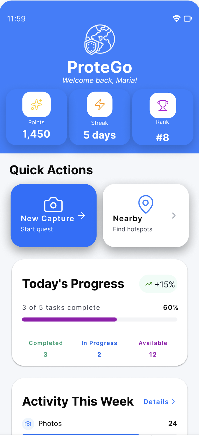
- Dashboard hierarchy redesign — Restructured the impact data display: community metrics (active members, photos shared, locations mapped) moved from flat lists to a prioritized visual hierarchy. Community Highlights, Top Contributors, and Activity Feed each got distinct visual treatment.
- Navigation simplification — Collapsed a multi-level drawer navigation into a persistent 4-tab bottom bar (Home · Quest · Profile · Community). Reduced the average tap count to reach any primary surface from 2–3 to 1.
- Gamification legibility — Points, Streak, and Rank displays redesigned to scan instantly. Daily Quest progress elevated to profile header. Achievement system structured to give new users an early win within their first session.
- Quest detail + capture entry — Designed the browsing → detail → capture handoff so the transition from "see a quest" to "start capturing" requires one decision, not several.
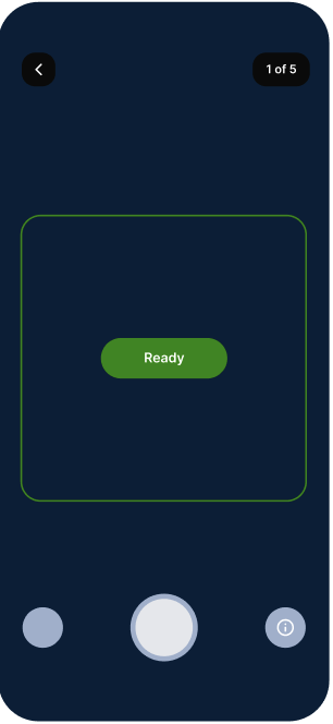
- AR capture flow — A 5-step angle-detection camera flow for location documentation. Each step handles one micro-decision: approach, frame, detect angle, confirm, submit. Designed, fully specified, and handed off to engineering.
Core User Flow
The quest completion loop is the primary value cycle — the design work focused on reducing friction at every handoff point in this sequence.
Key Decisions
The original dashboard showed all impact stats (active members, photos shared, locations mapped) at equal visual weight. For a new user, this read as noise. The redesign established a reading order: a clear lead first, supporting stats beneath. The leading question — "what has this community actually done?" — now has a one-second answer.
The AI camera capture feature required users to detect angles, confirm positioning, and submit documentation in one interaction. The first instinct was a single camera screen with overlaid controls. The design problem: that collapsed multiple distinct decisions into one overwhelming moment. I proposed a progressive 5-step flow — each screen handles exactly one micro-decision — keeping the cognitive load per step near zero. This was designed, spec'd, and handed off to engineering.
The existing slide-out navigation required two interactions to switch surfaces — open drawer, select. In a quest-completion flow where users move between Home, Quest, and Profile frequently, this doubled the navigation cost. The bottom tab bar made every primary surface reachable in one tap. Small change, meaningful reduction in navigation cost for a task-completion product.
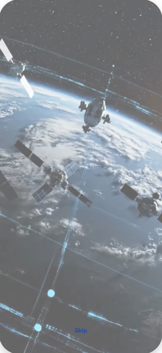
The gamification system had meaningful long-term rewards but nothing that activated immediately. I redesigned the onboarding and first-session quest entry to surface a completable quest within the first two minutes — giving new users a first achievement before they had a reason to leave. The Daily Quest progress bar was elevated to the profile header to keep the near-term goal visible at all times.
State of the Work
Professional engagement. The dashboard redesign, navigation simplification, gamification legibility improvements, and quest capture entry all shipped to MVP. A further set of features — including the 5-step AR camera capture flow — was designed, fully specified, and handed off to engineering.
Want more depth? In an interview I can walk through my role, process, and design rationale on this project — within the bounds of the client's NDA. Anything beyond that is shared only with the client's permission.
Get in touch →How It Was Made
The ProteGO redesign was produced AI-assisted, with Claude used for structure and iteration alongside the interface work. What is shown here is limited by NDA; the method is not.
The product direction, the constraints and every judgment call are mine. I note the method explicitly because it is how I work now — and because being vague about provenance would undercut the point.