The Problem
Circadian health research has established, clearly and repeatedly, that light exposure is the primary signal our bodies use to set their internal clock. Morning bright light, afternoon spectrum shifts, evening warm-and-dim — the sequence and quality of light across the day governs sleep, alertness, mood, and metabolic function in ways that dwarf what most people attribute to diet or exercise.
This knowledge lives almost entirely in research literature and is almost entirely absent from how people actually move through their days. People know "get outside in the morning" the same way they know "drink more water" — as an abstract instruction, disconnected from any particular environment or moment, with no feedback loop when they get it right or wrong.
The design problem: how do you make the light environments people already move through legible and actionable — without making it feel like a health tracking app, and without requiring behavior change that doesn't fit how people actually live?
What I Designed
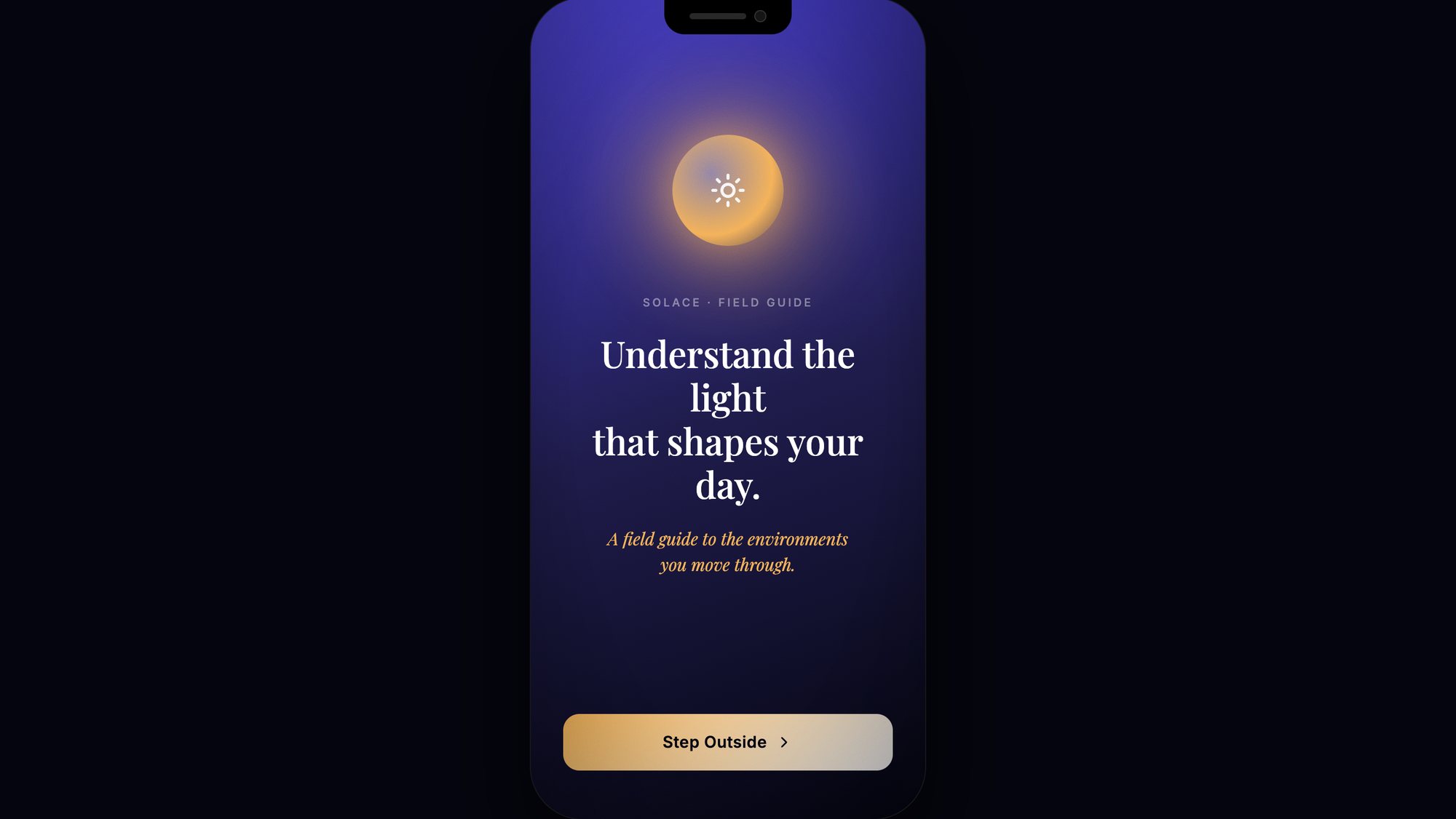
The field guide frame
The central design decision is the "field guide" metaphor — and it's doing a lot of work. A field guide is not a tracking app. It does not log your behavior, compare you to yesterday, or tell you you're falling behind. A field guide describes what exists in the world and how to read it. It assumes the reader is curious, capable, and already out there — just needing language for what they're experiencing.
This framing sets Solace apart from circadian health apps that approach light as a compliance problem. The target user isn't someone trying to optimize their sleep data. It's someone who has noticed — or is ready to notice — that different environments feel different, and wants to understand why.
Environments, not habits
The core unit of Solace is the environment, not the habit or the metric. Moving through different light environments across the day — the quality of early morning outside light, the particular blue-cast of a screen at noon, the warmth of an indoor lamp in the evening — is the actual mechanism of circadian regulation. The app describes these environments as they occur, rather than prescribing behaviors in the abstract.
"Step Outside" as the primary onboarding CTA is precise and intentional. Not "start tracking." Not "set your wake time." Step outside. The first interaction is an act, not a configuration.
Visual language — dark and luminous
The aesthetic is built from darkness and light, in exactly the proportion the product requires: a deep indigo/purple field — the color of a sky just before dawn — with a single warm light source at the center, radiating outward. The typography is warm-white on dark, with amber-gold used for the name and for anything that moves. Nothing competes with the light; everything defers to it.
This is a product whose entire subject is how light feels. The visual design has to demonstrate that the team understands what it's talking about — by looking the way that knowledge actually feels.
Solo design — PereX product
Solace is a PereX solo product. Every decision — concept, research framing, visual identity, UX architecture, copy — is mine. This is distinct from collaborative work like NuvAI, where the product design is co-owned. With Solace, I have complete design sovereignty, and the work reflects that: no compromise toward a partner's preferences, no governance document, just the accumulation of my own aesthetic and intellectual stance.
Key Decisions
The dominant paradigm in health tech is tracking — logging behavior against a baseline, generating data, scoring compliance. Solace explicitly rejects this frame. A field guide gives language to what already exists in the world. It makes the user a naturalist, not a patient. This is a product philosophy decision that determines everything downstream: what the app shows, what it measures (or doesn't), how it speaks, what it rewards.
Most circadian apps are built around time (sleep windows, wake times, light exposure windows). Solace is built around environments — because environments are what people actually move through. You don't experience "a 2-hour bright-light morning window." You experience a park, or a kitchen, or a desk near a window. Designing around environments aligns the product with lived experience rather than the research abstraction.
"Step Outside" is not a feature. It's the first interaction. The design choice to make onboarding an act rather than a setup sequence reflects a specific belief about where behavior change happens: not in a settings screen, but in the threshold moment between reading about something and doing it. The app sends you outside before it explains itself. This is a high-risk move that only works if the product concept is strong enough to be compelling before it's explained.
An app about light that doesn't demonstrate sophisticated visual thinking about light is self-refuting. The dark-and-luminous aesthetic isn't decoration — it's a proof. It says: the people who made this understand the quality of light well enough to design with it. If a hiring team or investor can feel what the product is about by looking at the screen, the visual design is doing its job.
Outcome (current state)
Solace is in active development as a PereX product. The concept, brand system, and field guide experience architecture are defined. The visual identity is complete — dark, luminous, warm, grounded.
As a solo product, Solace represents a different kind of portfolio signal than NuvAI or InShore: it shows what I build when no one has asked me to build anything. That combination — circadian health science, behavioral design for real-world behavior change, a strong aesthetic point of view, and solo execution — is what I bring to teams working on products that ask people to show up differently in their lives.