The Problem
When you relocate internationally, navigating health insurance in an unfamiliar system — different coverage types, different terminology, different provider networks — is one of the highest-stakes tasks you face and one of the least supported. Most people manage it through a combination of online searching, word of mouth, and anxiety.
InShore's premise: build a product that connects expats with the best-fit health insurance options for their new country, then manages that coverage in one place — policies, claims, appointments, and alerts — so that after the chaos of relocation, health coverage is the one thing that feels handled.
What I Designed
Onboarding and discovery flow
The onboarding surfaces what the app does immediately and without jargon: "Our app helps you find the best health insurance options when relocating to a new country. We make the process easy and stress-free so you can focus on your new adventure." The health questionnaire that follows qualifies the user's coverage needs — age, pre-existing conditions, coverage priorities — before surfacing options. The questionnaire was designed to feel like a guided conversation, not a form.
Find Insurance — the core flow
The primary job of the app. Users search for and compare coverage options filtered to their relocation context. The design prioritizes clarity over comprehensiveness — showing what matters for the decision (coverage type, network, price range, key inclusions) without overwhelming with plan details before the user is ready for them.
Policy management
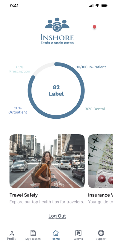
Once insured, users manage their active policies in one place — viewing coverage details, checking what's included, and accessing policy documents. The Policies screen is designed around the question people actually ask: "Am I covered for this?" — not around how insurance companies structure their product offerings.
Claims
Filing and tracking claims with file upload, status tracking, and WhatsApp integration for documentation. Claims history gives users a running record without requiring them to maintain their own. The overview shows totals and status at a glance — approved, pending, rejected — so users always know where things stand without chasing their insurer.
Calendar and alerts
Health appointments, policy renewal dates, and premium payment reminders — all surfaced in a calendar layer so nothing gets missed in the cognitive fog of living somewhere new.
Navigation architecture
Five-tab bottom navigation: Home · Find Insurance · Policies · Claims · Support. The tab order reflects usage frequency and urgency — Find Insurance as the primary action (for new users), Policies and Claims as the core ongoing usage, Support accessible without navigation. Profile sits outside the main tabs as a secondary utility.
Brand System
InShore's brand is built around four values: reliability, cleanliness, technology, and quick action. The typographic system reflects these — Lato (Bold) for wordmark, headlines, and CTAs: geometric, clean, immediately legible. Open Sans for subheadings and legal disclaimers: a humanist touch that softens the technical context. Roboto for body copy: neutral, readable at every size.
The design direction is "trusted utility" — not the warm, lifestyle-forward aesthetic of consumer health apps, and not the cold institutional look of insurance portals. The app needs to feel like something an expat would trust with something important, not just browse.
Key Decisions
Most insurance products lead with a catalogue. InShore leads with a health questionnaire that understands the user's situation first, then surfaces relevant options. The design bet: people don't want to browse health insurance. They want to be shown what's right for them. The questionnaire earns the recommendation before making it.
"Am I covered for this?" is the question users come back to most. The Policies screen is organized around this — coverage detail is surfaced at the top, not buried in a document download. The information architecture follows the user's mental model, not the insurer's product structure.
Chasing a claim is one of the most frustrating experiences in any insurance relationship. InShore's claims design gives users real-time status visibility and a clear history so the burden of tracking doesn't land on them. Integration with WhatsApp for document submission meets users where they already manage communication on the move.
The brand and visual direction are deliberate: this is a serious tool for a high-stakes context. The people using it are managing something genuinely important while navigating an already stressful transition. The design earns trust by looking and behaving like something that takes them seriously.
Outcome
A complete mobile product design: onboarding, health questionnaire, insurance discovery, policy management, claims filing and tracking, calendar and alerts, and a production-ready brand system. The full artifact set — user flows, screens, brand system — is available on request.