The Problem
Why productivity tools fail this user
Most productivity tools assume the user's bottleneck is organization. For people with executive-function strain — ADHD, burnout, overwhelm — the bottleneck is activation: knowing the next move and being able to begin it. Worse, the standard fix (more lists, more notifications, more structure) adds cognitive load and shame, making the freeze deeper.
The design question
The design question: what would a tool look like if its only job was to lower the activation energy of the very next micro-move?
Around 15.5 million U.S. adults live with an ADHD diagnosis — and research shows they lose an average of 21.6 more workdays per year to executive dysfunction than neurotypical peers. The tools meant to help compound the problem: 73% of users abandon new productivity apps within 30 days, and 67% report feeling stressed by apps with too many features. More structure isn't the answer. Lower friction is.
What I Designed
- A widgets-first interaction model — surface the one next action in the environment, rather than making the user open an app, navigate, and decide. The interface comes to the moment instead of waiting to be visited.
- Environmental prompting — gentle, context-aware cues that nudge the next step without demanding a planning session first.
- Friction reduction as the core metric — every screen judged by how much it lowers the cost of starting, not by how much it can hold.
- Anti-shame, humanistic defaults — no streaks to break, no guilt mechanics, no productivity moralizing. Missing a day costs nothing.
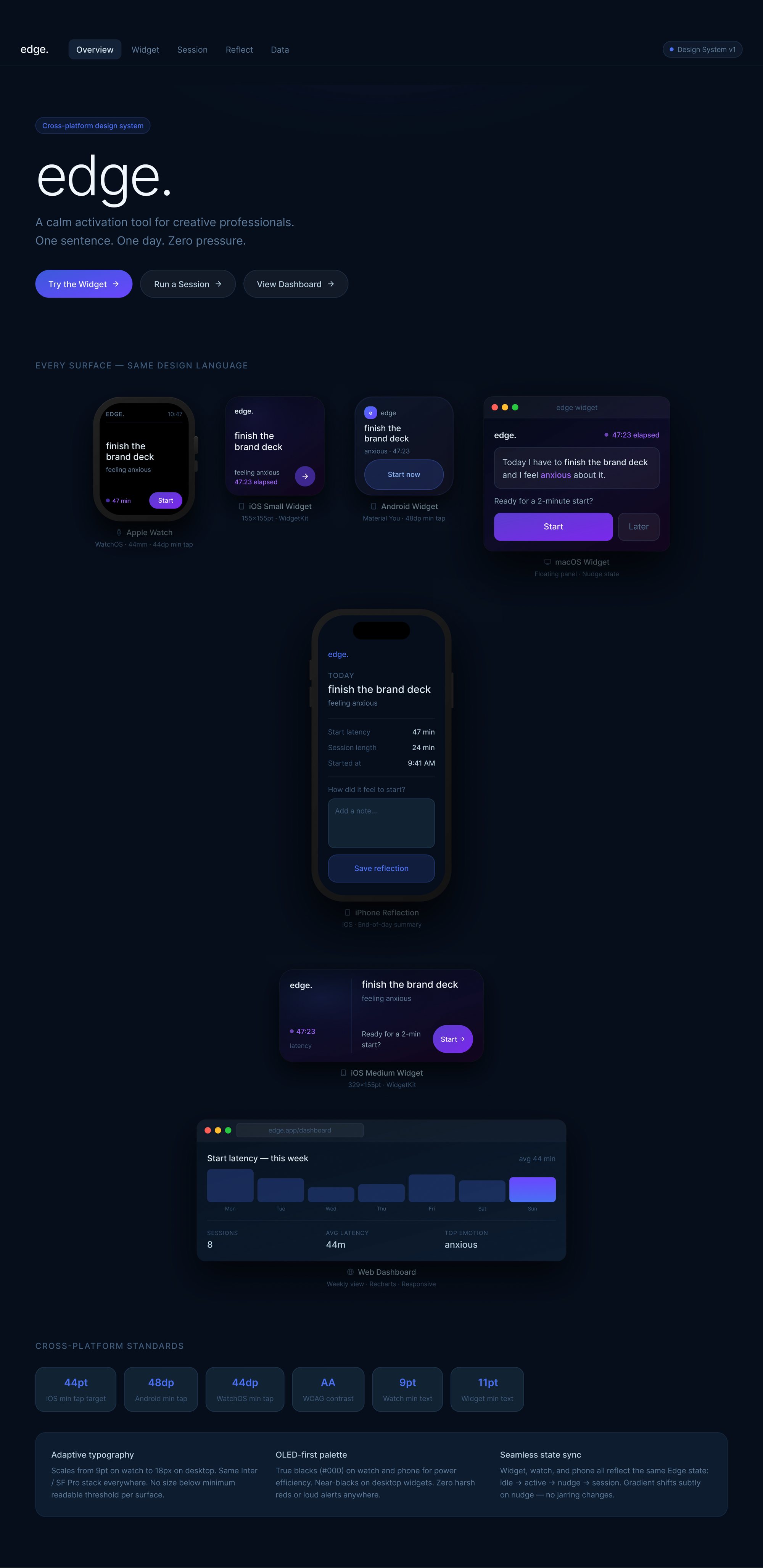
Built in Figma Make — click through the activation flow from widget to done state.
Key Decisions
Showing everything is what freezes EF-strained users. Edge deliberately hides the backlog to protect activation. The "helpful" list of everything you haven't done is, for this user, a demoralizing wall. The design decision is to remove the wall.
The decision that defines it — reduce the steps between intention and action to as close to zero as possible. An app requires a decision to open it. A widget reduces the opening cost to nothing. For EF-strained users, that zero-cost entry is the difference between doing the thing and not.
No streaks, no shame, no dark patterns — they work against the people this is for. Edge is the most personal of these frameworks. I designed it from the inside of this experience, not from the outside. The anti-shame defaults aren't philosophically derived — they're personally necessary.
Design Status — Working Prototype, Not Yet Validated
There is a live, interactive prototype (built in Lovable), but Edge has not been user-tested with people who live with executive-function challenges. The interaction model, widget-first approach, and anti-shame defaults represent design intent grounded in personal experience and secondary research — not evidence from formative or summative testing with the target population.
Next step: Recruit 6–10 adults with ADHD or executive-function diagnoses for contextual inquiry and prototype testing before any development commitment.
State of the Work
A working prototype backed by a concept framework — interaction model, environmental-prompting approach, and a set of design principles. Not yet user-tested, but a real, interactive surface and a clear, opinionated point of view on designing for cognition under strain, grounded in genuine insight into how activation actually fails.
The thinking in Edge directly informs EOS — the personal execution infrastructure I built and run daily. Edge is the concept; EOS is what the concept becomes when applied to real execution under real conditions.